
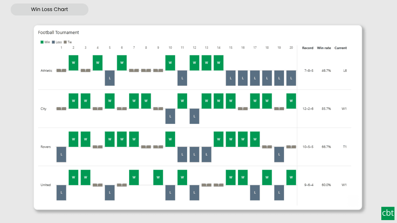
What it does.
Two people can both hit target half the time and be telling completely different stories. One alternates week to week; the other lost thirteen in a row and then won thirteen. A win rate cannot tell them apart, because a rate throws away the order. The Win Loss Chart keeps it.
Every period draws one equal-sized mark: above the baseline for a win, below for a loss, a small tick for a tie, and a gap where there was no event. Magnitude is discarded on purpose. That is what lets a whole team's year sit on one screen, and what sends the eye to the runs and reversals rather than to the size of any single result.
Power BI has no native win/loss sparkline. Its own sparklines offer line and column types only, cap at 52 points, and allow five per visual. Working out streaks in DAX is awkward enough that it is a recurring community question. This visual computes records, win rates and streaks itself, with no measures to write.
Use Cases • Which sales reps hit quota most consistently, and who is on a losing run right now • Which months each store beat budget, across several years • SLA met or missed per day, per support queue • League form guides and match results, with the current streak • Up days and down days per instrument • Whether each production line met its defect target, where lower is better
What ships today, what’s next.
Available now16 capabilities
- Win, loss and tie marks on a shared baseline, with gaps for missing periods
- Outcome by sign, by target measure, or by fixed threshold
- Tie tolerance and a lower-is-better switch
- Optional text Outcome column, with editable match lists
- Record, win rate, current streak and longest streaks per row
- Three win-rate definitions for how ties are counted
- Streak highlighting with bracket or outline
- Four mark shapes and Excel-style point markers
- Data labels with automatic fit and contrast
- Sequence reference markers and bands
- Small multiples on a shared timeline
- Sorting by seven keys, rows only
- Cross-filtering, drill-down, report page tooltips, bookmarks
- Keyboard navigation and screen-reader accessibility
- High-contrast mode support
- Landing page quick-start guidance
On the roadmap2 planned
- A rolling win-rate overlay
- A calendar layout.
Other custom visuals.
23 more visuals in the catalogue. All free to download.
Waffle Chart
Show part-to-whole proportions, track progress toward targets, or break totals by category.
Learn more →Histogram
Interactive histogram for visualizing the distribution of a continuous measure, with flexible binning, weighted bin heights, and built in statistical overlays.
Learn more →Dual Hierarchy Decomposition Tree Pro
DAX-driven KPI tree with dual-axis drill-down, per-KPI colors, icons, and Microsoft-certified Pro features.
Learn more →Advanced Sankey Diagram
Interactive Power BI Sankey diagram for visualizing multi-stage flow data, with automatic node-to-ribbon color gradients and rule-based conditional formatting.
Learn more →Sparkline KPI Card
KPI Card with Sparkline for Power BI that displays KPI values, previous period comparisons, targets, variance, trend indicators, and interactive sparklines in a compact, business-ready visual.
Learn more →Cluster Analysis Chart
A scatter plot that groups points into clusters by similarity using K-Means, DBSCAN, or Hierarchical clustering. Shows centroids, hulls, ellipses, outliers, and dendrograms, with no R or Python.
Learn more →Lollipop Chart
Compare one value across many categories with clean stems and markers on a shared scale, and track each category against its target.
Learn more →Bullet Chart
Compare performance against multiple targets with qualitative bands, variance, and small multiples.
Learn more →Advanced Gantt Chart
Interactive Gantt chart for visualizing hierarchical project schedules, with automatic parent task rollups, dual baseline and actual timeline bars, and rule-based conditional formatting.
Learn more →Radial Histogram
Interactive radial histogram, wedges radiating from a center point, area-correct by default.
Learn more →Pareto Chart
Sort causes largest first, accumulate them, and mark the vital few that reach your threshold.
Learn more →Dual Axis Bar & Column Chart
Plot two measures on independent scales without dropping in a separate combo chart.
Learn more →Dual Hierarchy Decomposition Tree
Up to four KPIs per card across two hierarchy axes, with DAX-driven status colours.
Learn more →Multi KPI Decomposition Tree
Decompose up to five measures per node, with stacked bars on every branch.
Learn more →Arabic Matrix Table
Right-to-left matrix with Arabic labels, hierarchical rows, subtotals and grand totals.
Learn more →Arabic Stacked Bar Chart
RTL-native stacked bars with Arabic number units, small multiples and cross-filtering.
Learn more →Arabic Stacked Column Chart
RTL-native stacked columns matched to the Arabic Bar visual for consistent dashboards.
Learn more →Arabic Waterfall Chart
Sequential value walk for Arabic dashboards — variance, build-up and bridge analyses.
Learn more →Dumbbell Chart
Two markers per category on a shared scale, connected by a line that makes the gap immediately visible.
Learn more →Counts Plot
Visualise data distribution with dots scaled by frequency across category lanes.
Learn more →Jitter Plot
Show every data point with jitter or beeswarm layout for distribution analysis.
Learn more →Auto Single Select Slicer
Smart Power BI slicer with automatic first-value selection — reports never load with an empty filter.
Learn more →AutoSelect Slicer
Smart Power BI slicer with automatic selection across single-select and multi-select scenarios.
Learn more →Need a custom Power BI visual built for your reporting?
Thirty minutes with a senior BI consultant. We’ll walk your report, scope the visual, and tell you whether a build makes sense.