
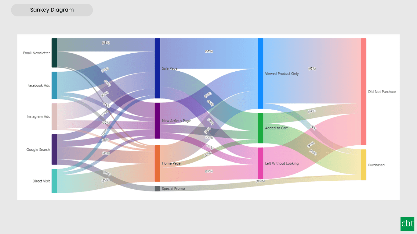
What it does.
Business users frequently need to understand how values move and transform across multiple stages, customer journeys through a website, budget allocations across departments, conversion funnels from lead to sale. Power BI has no native Sankey visual, leaving users to either rely on external tools or fall back to bar charts and tables that lose the sense of flow and stage-to-stage transformation entirely.
Sankey Diagram solves this by rendering multi-stage data as connected nodes and proportionally sized ribbons, with colors that flow naturally from each node into its outgoing ribbons via automatic gradients, no manual recoloring required, though individual flows can still be overridden by hand. Conditional formatting rules can also drive flow colors automatically based on value thresholds, surfacing outliers and problem areas at a glance without manual styling.
The visual supports both Horizontal and Vertical layouts to match any report design, with full control over node alignment, width, and spacing. Clicking any node or flow highlights its complete upstream and downstream path while dimming everything unrelated, letting users trace a single journey through a complex diagram instantly.
Formatting options such as value and percentage labels, font styling, display units, and decimal precision apply independently to node labels and flow labels. The visual supports Power BI's native interactions, cross-filtering, right-click context menus, tooltips, keyboard navigation, and high-contrast theming, and its default colors draw from the report's own theme palette, so it stays visually consistent with the rest of the report.
The visual integrates naturally with Power BI and gives report authors a way to communicate complex, multi-step processes clearly, without needing a separate tool outside the report.
What ships today, what’s next.
Available now11 capabilities
- Interactive Sankey diagram for multi-stage flow data
- Node-driven gradient coloring, with manual per-flow color override
- Conditional formatting for automatic, rule-based flow coloring
- Click-to-trace interactivity, highlights a node or flow's full connected path
- Horizontal and Vertical layout support
- Value and Percentage labels, independently configurable for nodes and flows
- Node alignment, width, and spacing controls
- Rich text formatting and display units for labels
- Theme-aware default colors from the report's color palette
- Cross-filtering and native Power BI interaction support
- User-friendly formatting pane configuration
On the roadmap2 planned
- Cyclical flow structures
- Drag node's position
Other custom visuals.
23 more visuals in the catalogue. All free to download.
Waffle Chart
Show part-to-whole proportions, track progress toward targets, or break totals by category.
Learn more →Histogram
Interactive histogram for visualizing the distribution of a continuous measure, with flexible binning, weighted bin heights, and built in statistical overlays.
Learn more →Dual Hierarchy Decomposition Tree Pro
DAX-driven KPI tree with dual-axis drill-down, per-KPI colors, icons, and Microsoft-certified Pro features.
Learn more →Sparkline KPI Card
KPI Card with Sparkline for Power BI that displays KPI values, previous period comparisons, targets, variance, trend indicators, and interactive sparklines in a compact, business-ready visual.
Learn more →Cluster Analysis Chart
A scatter plot that groups points into clusters by similarity using K-Means, DBSCAN, or Hierarchical clustering. Shows centroids, hulls, ellipses, outliers, and dendrograms, with no R or Python.
Learn more →Lollipop Chart
Compare one value across many categories with clean stems and markers on a shared scale, and track each category against its target.
Learn more →Bullet Chart
Compare performance against multiple targets with qualitative bands, variance, and small multiples.
Learn more →Advanced Gantt Chart
Interactive Gantt chart for visualizing hierarchical project schedules, with automatic parent task rollups, dual baseline and actual timeline bars, and rule-based conditional formatting.
Learn more →Radial Histogram
Interactive radial histogram, wedges radiating from a center point, area-correct by default.
Learn more →Pareto Chart
Sort causes largest first, accumulate them, and mark the vital few that reach your threshold.
Learn more →Win Loss Chart
A win/loss sparkline for Power BI. Each period is one equal-sized mark above or below a baseline, so streaks and form are visible at a glance across many rows at once.
Learn more →Dual Axis Bar & Column Chart
Plot two measures on independent scales without dropping in a separate combo chart.
Learn more →Dual Hierarchy Decomposition Tree
Up to four KPIs per card across two hierarchy axes, with DAX-driven status colours.
Learn more →Multi KPI Decomposition Tree
Decompose up to five measures per node, with stacked bars on every branch.
Learn more →Arabic Matrix Table
Right-to-left matrix with Arabic labels, hierarchical rows, subtotals and grand totals.
Learn more →Arabic Stacked Bar Chart
RTL-native stacked bars with Arabic number units, small multiples and cross-filtering.
Learn more →Arabic Stacked Column Chart
RTL-native stacked columns matched to the Arabic Bar visual for consistent dashboards.
Learn more →Arabic Waterfall Chart
Sequential value walk for Arabic dashboards — variance, build-up and bridge analyses.
Learn more →Dumbbell Chart
Two markers per category on a shared scale, connected by a line that makes the gap immediately visible.
Learn more →Counts Plot
Visualise data distribution with dots scaled by frequency across category lanes.
Learn more →Jitter Plot
Show every data point with jitter or beeswarm layout for distribution analysis.
Learn more →Auto Single Select Slicer
Smart Power BI slicer with automatic first-value selection — reports never load with an empty filter.
Learn more →AutoSelect Slicer
Smart Power BI slicer with automatic selection across single-select and multi-select scenarios.
Learn more →Need a custom Power BI visual built for your reporting?
Thirty minutes with a senior BI consultant. We’ll walk your report, scope the visual, and tell you whether a build makes sense.