
What it does.
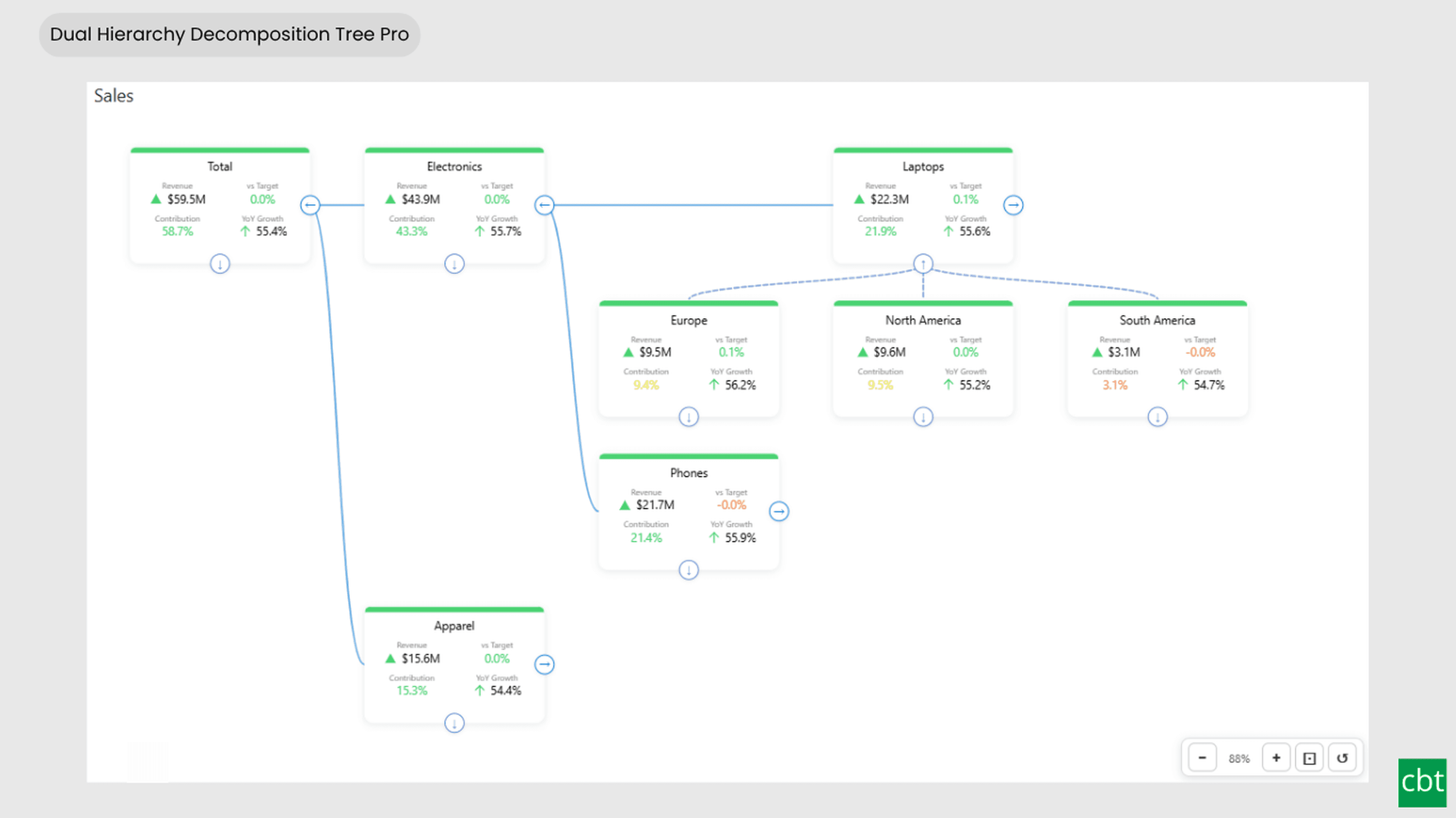
Dual Hierarchy Decomposition Tree Pro displays your key performance indicators in an interactive, expandable tree layout that supports two independent hierarchy axes simultaneously, with DAX-driven font colors and icons at every node level.
Add fields to Hierarchy 1 (Horizontal) to expand cards to the right - for example, by Region or Department. Add fields to Hierarchy 2 (Vertical) to expand cards downward - for example, by Category and Product. Use one axis or both together for matrix-style analysis across two dimensions.
Each card displays up to 4 KPI measures side by side: revenue, target percentage, year-over-year growth, status text, or any DAX measure you choose. Numeric values aggregate correctly on parent nodes using Power BI's native subtotal engine, and percentage or ratio measures use DAX-evaluated totals rather than simple averages. String measures such as status text also display correctly at every aggregation level.
Pro features include DAX-driven per-KPI font colors and icons - each value slot can have its own color and icon driven by your DAX measures, evaluated independently at every card in the tree. Choose from 10 built-in icons (arrows, triangles, circles, checks, warnings) or override icon colors inline with hex syntax. Build conditional formatting that responds to your business logic at every drill level.
The colored status bar at the top of each card can be driven by a DAX measure returning hex color codes, enabling traffic-light indicators, threshold-based coloring, or any custom business logic - evaluated independently at every node in the tree.
The visual remembers your view state - expand and collapse states, zoom level, and viewport position persist across slicer changes, page navigation, and report reopens. Smart recenter keeps the active card in view when expanding new hierarchy levels.
Format each KPI slot independently with its own font, size, color, display units, and decimal places, or apply a single global style to all values. Customize card dimensions, gaps, title formatting, label formatting, background colors, and border colors from the standard Power BI format pane.
Try it free for 1 month - full Pro features unlocked during the trial period. After trial: continue with the free tier (basic tree, status bar colors, recenter, persistence) or subscribe for full Pro features.
What ships today, what’s next.
Available now13 capabilities
- Bi-directional tree layout with horizontal and vertical hierarchy axes
- Up to 4 KPI measures displayed per card
- DAX-driven status bar colors with hex code support
- Per-KPI font colors via DAX (Pro) - 4 dedicated data role slots
- Per-KPI icons via DAX (Pro) - 4 slots, 10 built-in icons, inline color override
- Smart recenter on expand - active card stays in view through drill operations
- State persistence - expansion state, zoom, and viewport restore across sessions
- Watermark and logo removal (Pro) - clean enterprise appearance
- Hierarchy label on each card showing the dimension context
- Per-slot value formatting - independent font, size, color, display units, and decimal places
- Multi-level drill-down on both axes with expand/collapse controls
- Navigation tools - Ctrl+scroll zoom, click-drag pan, fit-to-page, zoom toolbar
- 1-month free trial - full Pro features during trial period
Other custom visuals.
13 more visuals in the catalogue. All free to download.
Sankey Diagram
Interactive Power BI Sankey diagram for visualizing multi-stage flow data, with automatic node-to-ribbon color gradients and rule-based conditional formatting.
Learn more →Dual Axis Bar & Column Chart
Plot two measures on independent scales without dropping in a separate combo chart.
Learn more →Dual Hierarchy Decomposition Tree
Up to four KPIs per card across two hierarchy axes, with DAX-driven status colours.
Learn more →Multi KPI Decomposition Tree
Decompose up to five measures per node, with stacked bars on every branch.
Learn more →Arabic Matrix Table
Right-to-left matrix with Arabic labels, hierarchical rows, subtotals and grand totals.
Learn more →Arabic Stacked Bar Chart
RTL-native stacked bars with Arabic number units, small multiples and cross-filtering.
Learn more →Arabic Stacked Column Chart
RTL-native stacked columns matched to the Arabic Bar visual for consistent dashboards.
Learn more →Arabic Waterfall Chart
Sequential value walk for Arabic dashboards — variance, build-up and bridge analyses.
Learn more →Dumbbell Chart
Two markers per category on a shared scale, connected by a line that makes the gap immediately visible.
Learn more →Counts Plot
Visualise data distribution with dots scaled by frequency across category lanes.
Learn more →Jitter Plot
Show every data point with jitter or beeswarm layout for distribution analysis.
Learn more →Auto Single Select Slicer
Smart Power BI slicer with automatic first-value selection — reports never load with an empty filter.
Learn more →AutoSelect Slicer
Smart Power BI slicer with automatic selection across single-select and multi-select scenarios.
Learn more →Need a custom Power BI visual built for your reporting?
Thirty minutes with a senior BI consultant. We’ll walk your report, scope the visual, and tell you whether a build makes sense.