
What it does.
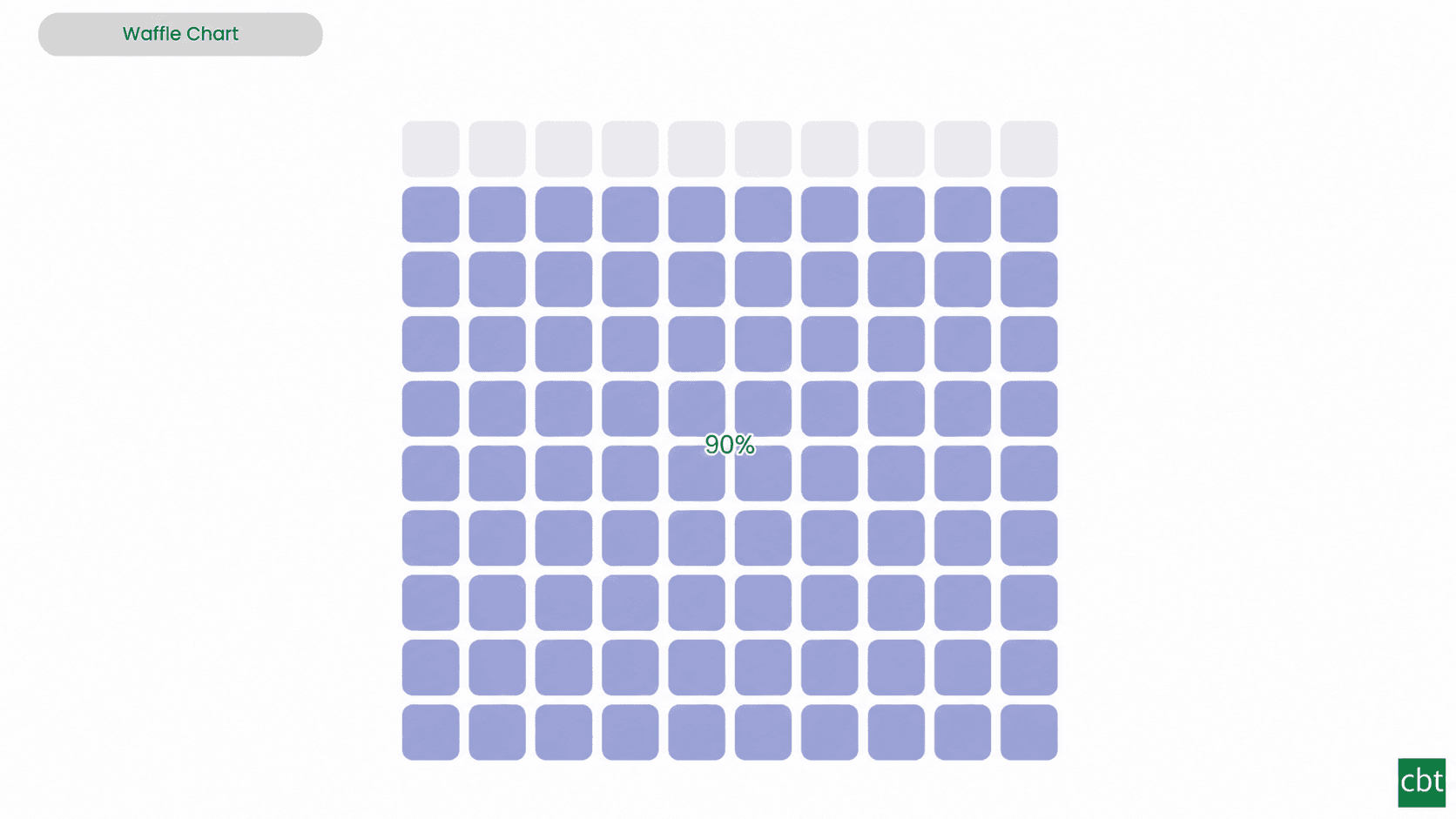
Business audiences often need to read a proportion at a glance - how far a metric has progressed toward its goal, or how a total divides across categories. A pie or donut forces the reader to judge angles, and a bare percentage gives no sense of scale. Waffle Chart renders the value as a grid of cells - by default a 10x10 block where each cell is one percent - so the proportion can be seen and counted precisely, down to a single point.
The visual works in two modes. In progress mode it fills cells up to a value's share of a target or maximum, leaving a styled remainder, with optional over/under colouring that grades the grid against its goal and a defined behaviour for values beyond 100%. In part-to-whole mode a single grid is filled by several categories in sequence, each in its own colour, with a legend - so the composition of a total reads as clearly as its size.
The grid is fully configurable - any number of rows and columns, square, circle, or rounded cells, with adjustable gap and fill direction - and cells can be replaced with icons for pictograph (isotype) displays drawn from a built-in set or a custom SVG path. Conditional formatting colours cells by rules, gradient, or field value, and currency and percentage formats are read directly from the data model.
A configurable centre label presents the headline percentage or value, and a Small Multiple field splits the visual into a responsive grid of waffles that share one scale for side-by-side comparison. Full Power BI interactivity is built in - selection, multi-select, cross-highlighting, bookmarks, and the host context menu all work natively.
What ships today, what’s next.
Available now12 capabilities
- Configurable grid with 1–50 rows and columns, adjustable cell shape, gap, fill direction, and cell ordering
- Two fill modes: Part-to-Whole for category breakdowns and Single Value for progress toward a target
- Customizable category colours with base-colour fallback, theme palette support, remainder styling, and cell outlines
- Conditional colour formatting using rules, gradients, or field values through the fx control
- Centre labels with Percent, Value, or Both options, plus category labels with optional values and full font controls
- Flexible value formatting with display units, decimal places, percentage decimals, and model-based currency or percentage formatting
- Configurable legend with position, title, font formatting, and optional per-category totals
- Target tracking with target markers, over/on/under-target colours, tolerance settings, and configurable over-100% behaviour
- Pictograph mode with 13 built-in icons, custom SVG paths, per-category icon overrides, and adjustable icon padding
- Small multiples for comparing groups with responsive waffle grids, panel titles, shared scales, max columns, and panel padding
- Rich tooltips showing category, value, percentage, target, achievement, and additional measures
- Interactive selection, multi-selection, cross-highlighting, bookmarks, and Power BI host context menus
On the roadmap2 planned
- Animated fill transitions
- Dynamic format strings
Other custom visuals.
23 more visuals in the catalogue. All free to download.
Histogram
Interactive histogram for visualizing the distribution of a continuous measure, with flexible binning, weighted bin heights, and built in statistical overlays.
Learn more →Dual Hierarchy Decomposition Tree Pro
DAX-driven KPI tree with dual-axis drill-down, per-KPI colors, icons, and Microsoft-certified Pro features.
Learn more →Advanced Sankey Diagram
Interactive Power BI Sankey diagram for visualizing multi-stage flow data, with automatic node-to-ribbon color gradients and rule-based conditional formatting.
Learn more →Sparkline KPI Card
KPI Card with Sparkline for Power BI that displays KPI values, previous period comparisons, targets, variance, trend indicators, and interactive sparklines in a compact, business-ready visual.
Learn more →Cluster Analysis Chart
A scatter plot that groups points into clusters by similarity using K-Means, DBSCAN, or Hierarchical clustering. Shows centroids, hulls, ellipses, outliers, and dendrograms, with no R or Python.
Learn more →Lollipop Chart
Compare one value across many categories with clean stems and markers on a shared scale, and track each category against its target.
Learn more →Bullet Chart
Compare performance against multiple targets with qualitative bands, variance, and small multiples.
Learn more →Advanced Gantt Chart
Interactive Gantt chart for visualizing hierarchical project schedules, with automatic parent task rollups, dual baseline and actual timeline bars, and rule-based conditional formatting.
Learn more →Radial Histogram
Interactive radial histogram, wedges radiating from a center point, area-correct by default.
Learn more →Pareto Chart
Sort causes largest first, accumulate them, and mark the vital few that reach your threshold.
Learn more →Win Loss Chart
A win/loss sparkline for Power BI. Each period is one equal-sized mark above or below a baseline, so streaks and form are visible at a glance across many rows at once.
Learn more →Dual Axis Bar & Column Chart
Plot two measures on independent scales without dropping in a separate combo chart.
Learn more →Dual Hierarchy Decomposition Tree
Up to four KPIs per card across two hierarchy axes, with DAX-driven status colours.
Learn more →Multi KPI Decomposition Tree
Decompose up to five measures per node, with stacked bars on every branch.
Learn more →Arabic Matrix Table
Right-to-left matrix with Arabic labels, hierarchical rows, subtotals and grand totals.
Learn more →Arabic Stacked Bar Chart
RTL-native stacked bars with Arabic number units, small multiples and cross-filtering.
Learn more →Arabic Stacked Column Chart
RTL-native stacked columns matched to the Arabic Bar visual for consistent dashboards.
Learn more →Arabic Waterfall Chart
Sequential value walk for Arabic dashboards — variance, build-up and bridge analyses.
Learn more →Dumbbell Chart
Two markers per category on a shared scale, connected by a line that makes the gap immediately visible.
Learn more →Counts Plot
Visualise data distribution with dots scaled by frequency across category lanes.
Learn more →Jitter Plot
Show every data point with jitter or beeswarm layout for distribution analysis.
Learn more →Auto Single Select Slicer
Smart Power BI slicer with automatic first-value selection — reports never load with an empty filter.
Learn more →AutoSelect Slicer
Smart Power BI slicer with automatic selection across single-select and multi-select scenarios.
Learn more →Need a custom Power BI visual built for your reporting?
Thirty minutes with a senior BI consultant. We’ll walk your report, scope the visual, and tell you whether a build makes sense.